You are using an out of date browser. It may not display this or other websites correctly.
You should upgrade or use an alternative browser.
You should upgrade or use an alternative browser.
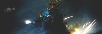
Awesomeness
- Thread starter Rising
- Start date
SEÑOR
The Guy Everyone Hates
- Messages
- 4,638
- Reaction score
- 0
- Points
- 0
8.5/10
-1 = Backgrounds ok not much brushing or anythign at all.
-0.5 = font dont like it in all your sigs your fonts are so small and like to camoflauged.
But its good work. Well done! I love your sigs and they just dont stop amazing me.
-1 = Backgrounds ok not much brushing or anythign at all.
-0.5 = font dont like it in all your sigs your fonts are so small and like to camoflauged.
But its good work. Well done! I love your sigs and they just dont stop amazing me.
chaganlal1
New Member
- Messages
- 2,014
- Reaction score
- 0
- Points
- 0
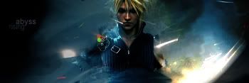
8/10 I think its a little small and unclear. I like the sig you have now though, Thats tight.
- x10Hosting Free Website Hosting
-
Free Web Hosting
-
Our Community
-
Legal