You are using an out of date browser. It may not display this or other websites correctly.
You should upgrade or use an alternative browser.
You should upgrade or use an alternative browser.
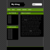
First ever site design!
- Thread starter intertec
- Start date
soporteweb
New Member
- Messages
- 64
- Reaction score
- 0
- Points
- 0
look good , but i think that the color is too dark, u can put more light color
|Born2Shoot|
GFX-Designer
- Messages
- 648
- Reaction score
- 0
- Points
- 0
get the border straights ")
Nice and clean simple layout, small good for beginner. Keep experimenting
Btw ive been watching your layouts. Dont be fooled by comments or be put down! Keep on going and you'll get better
Your on the right track mate!
m1nd
Nice and clean simple layout, small good for beginner. Keep experimenting
Btw ive been watching your layouts. Dont be fooled by comments or be put down! Keep on going and you'll get better
Your on the right track mate!
m1nd
Last edited:
Christopher
Retired
- Messages
- 14,659
- Reaction score
- 8
- Points
- 0
Looks ok.
The arrow thing that "My Blog" is in doesn't look to good.
Move anything that is hiding the border so it is visible.
Center the titles more.
Get rid of the shadow under the search box.
Much better than I could have done.
The arrow thing that "My Blog" is in doesn't look to good.
Move anything that is hiding the border so it is visible.
Center the titles more.
Get rid of the shadow under the search box.
Much better than I could have done.
mifuyu
New Member
- Messages
- 32
- Reaction score
- 0
- Points
- 0
I think you may need to work on the background itself, since a dull green isn't really matching with gray. I guess you could use a different shade of green, something striking/shocking will do. ^.~ And.. straighten those borders since the content are pretty much out of the line. ^^ It's a nice layout for your first attempt by the way. 
ashwinsinha
New Member
- Messages
- 278
- Reaction score
- 0
- Points
- 0
good enough!
7.7/10
7.7/10
D-MaN
New Member
- Messages
- 12
- Reaction score
- 0
- Points
- 0
Pretty good work!
The only nitpick i have is that the reflections of the links at the top is all weird looking. It almost looks like the reflective surface and the reflections themselves are on different planes; like the reflections start behind the actual text. Also, they're too strong; they should fade out a little bit more.
The only nitpick i have is that the reflections of the links at the top is all weird looking. It almost looks like the reflective surface and the reflections themselves are on different planes; like the reflections start behind the actual text. Also, they're too strong; they should fade out a little bit more.
- x10Hosting Free Website Hosting
-
Free Web Hosting
-
Our Community
-
Legal