I read comments on my first web template and now I have come back with a better one! Please like before, be HONEST. Say anything you want! And if anyone is interested of buying the template please pm me!
7/10
looks good
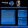
the metallic skull looks out of place, the banner doesn't seem to tie in with the content, and the gap between the links and the content could be a little closer,
but in all have a good design
You want honesty well, you can tell your a beginner but I when I started it was looking just like yours. Just keep making more and learning new techniques and styles. But as far as the one you made, don't use the custom photoshop shapes anyone who is familiar with ps can spot them and it takes originality out of your work. also you kind of just let the whole thing float put some backbone into it like a border maybe.The grey border around the news and and 2 side things don't help. And somethings wrong with your gradients they seem choppy and don't flow nice I don't know if you did that on purpose. Good things are it looks like you made your own logo and I like terminator so yea. Try these sites www.good-tutorials.com, www.pixel2life.com I pretty much learned from those two sites. I can also help you out if you need advice or help. I also have work I can show you.
")

