You are using an out of date browser. It may not display this or other websites correctly.
You should upgrade or use an alternative browser.
You should upgrade or use an alternative browser.
newish sig
- Thread starter Kraze_T
- Start date
deaddevil
New Member
- Messages
- 1,010
- Reaction score
- 0
- Points
- 0
I would rate is 6/10
Reasons:
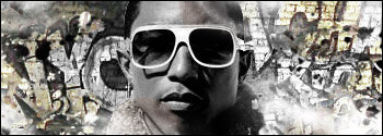
You can see the white brushing, maybe its for lighting or blending....it is noticible, not good.
There isn't much creativity, it looks like there is a background and you put the render, and just brushed around.
you could improve the sig by:
Maybe add a gradient map.
Add depth to the sig by black and white gradient.
Blend the render more , maybe a little more.
Let some color flow around.
I do not know if i am wrong, but these were some comments by me.
Reasons:
You can see the white brushing, maybe its for lighting or blending....it is noticible, not good.
There isn't much creativity, it looks like there is a background and you put the render, and just brushed around.
you could improve the sig by:
Maybe add a gradient map.
Add depth to the sig by black and white gradient.
Blend the render more , maybe a little more.
Let some color flow around.
I do not know if i am wrong, but these were some comments by me.
GFXDude2010
New Member
- Messages
- 59
- Reaction score
- 0
- Points
- 0
It'd be good if you had actually mad the BG... Anybody can crop, cpy/paste, lasso the render, and put it on the BG then don random brushings. It's gotta blend and flow!
Recommendations:
Make the render pop more, maybe with more color. Not totally grayscale. The BG is good, sure, but the random brushings aren't good. Make them overlayed or flow better.
5/10
Recommendations:
Make the render pop more, maybe with more color. Not totally grayscale. The BG is good, sure, but the random brushings aren't good. Make them overlayed or flow better.
5/10
- x10Hosting Free Website Hosting
-
Free Web Hosting
-
Our Community
-
Legal