You are using an out of date browser. It may not display this or other websites correctly.
You should upgrade or use an alternative browser.
You should upgrade or use an alternative browser.
Newst Sig
- Thread starter Kraze_T
- Start date
")
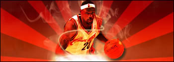
The background is very plain, I'll just say it
The render looks overly red
and the lighting is, I believe, coming from the wrong direction too strongly
Also, the pen stroke should have been erased once you got to the lower half, to make it look like it's spiraling around him
Keep at it though, I just have a way of pointing out negatives...probably to make myself feel better LOL
6/10
Last edited:
- x10Hosting Free Website Hosting
-
Free Web Hosting
-
Our Community
-
Legal