Web Designs(Pro! Can Buy If You Want)

Rising

New Member
Messages
792
Reaction score
0
Points
0
home3.jpg


On Sale With ALL CUSTOM PAGES! If you are interested PM me, Reply or email me at audioFEATUREX@aol.com
INFO: Unique (Only 1)
FULL RIGHTS (Resell)
Price: 25$

Custom Pages(LINKS):
Staff Page:
http://i18.photobucket.com/albums/b123/x66stupidkid6x/staff.jpg
Services Page:
http://i18.photobucket.com/albums/b123/x66stupidkid6x/services.jpg
Manual Page:
http://i18.photobucket.com/albums/b123/x66stupidkid6x/manual.jpg
Live Support:
http://s18.photobucket.com/albums/b123/x66stupidkid6x/?action=view&current=livesupport.jpg
Contact Page:
http://i18.photobucket.com/albums/b123/x66stupidkid6x/contact.jpg

CnC WELCOME!

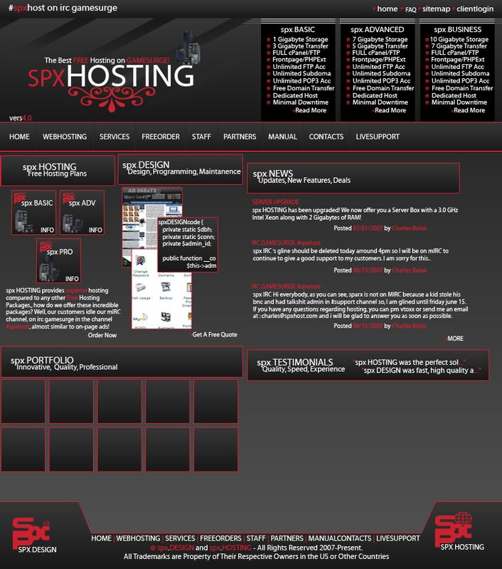
Also The Final Design for SPXHOST:
homev2v2.jpg


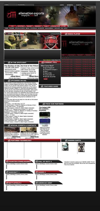
Alienation E-Sports Gaming League:
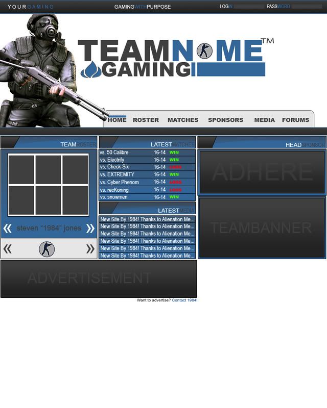
alienationesports.jpg


Gaming Template:(For Sale, Minus Alienation Media Design 15$)
index1copy.jpg


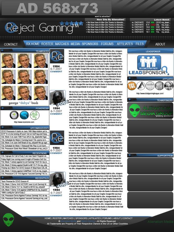
Counter-Strike Template:(For Sale: 10$)
Bluefurycopy.jpg
 

Zenax

Active Member
Messages
1,377
Reaction score
4
Points
38
That is some amazing work you have achieved there! I think the price you are selling at is a reasonable price, and I would not hesitate to buy one if I could afford it!
 

Rising

New Member
Messages
792
Reaction score
0
Points
0
thank you, well i just got a job at a new gfx company, so i am just looking to make some money for my new comp, i enjoy doing this, so i sell them cheaper
 

Despistado

New Member
Messages
96
Reaction score
0
Points
0
very professional look, the only thing i can comment is about the SPX size must be more big than the hosting word since is the logo.

best regards
 

maikefutesi

New Member
Messages
16
Reaction score
0
Points
0
I really dislike the red borders on the 1st layout. And your boxes aren't lined up either, I suppose that was the effect you were trying to achieve, however it doesn't appeal to me.

SPX Hosting the drop shadow doesn't make any sense to me... designers use shadows to simulate light sources... your buttons on top are supposed to stand out but don't (no shadow either) and that rectangle title inside of your right menu which is inside of your main container does not flow with the "simulated light source" (no shadow)

Others are okay, aside from the facts that they're all grid layouts, and you might want to start using more space too (too much stuff to look at).
 
Last edited:

System X

New Member
Messages
3
Reaction score
0
Points
0
Wow, I have to say those are truly professional. Very nice...now if only I had the money to buy them. Nice work though.
 

DMacK

Member
Messages
542
Reaction score
0
Points
16
There is definitely a lot going on in these layouts but they look pretty good. Nice work Rising
 
Top