Drawing - What do you think?

What do you think of this drawing?

  • 1 star

    Votes: 0 0.0%
  • 2 stars

    Votes: 1 3.8%
  • 3 stars

    Votes: 0 0.0%
  • 4 stars

    Votes: 0 0.0%
  • 5 stars

    Votes: 0 0.0%
  • 6 stars

    Votes: 2 7.7%
  • 7 stars

    Votes: 7 26.9%
  • 8 stars

    Votes: 8 30.8%
  • 9 stars

    Votes: 4 15.4%
  • 10 stars

    Votes: 4 15.4%

  • Total voters
    26

Swiblet

New Member
Messages
1,114
Reaction score
0
Points
0
I've been planning to make a comic called Hellchild for a while now, but my Deviantart page has been sooooo full of requests =< I have too many things to do!!!

But luckily, I was able to find the time to make a quick preview. The only difference is that the actual comic won't be in color.
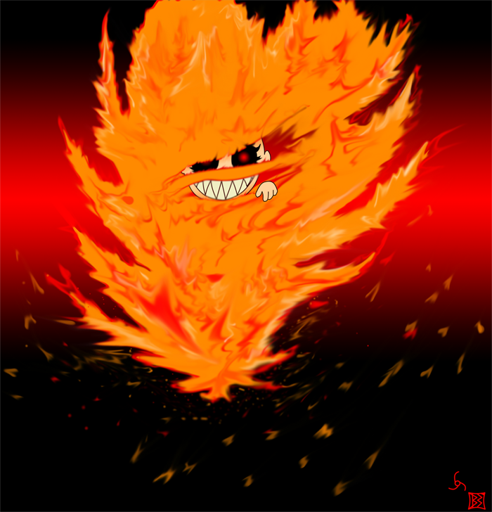
FieryBaby.png


Caption____________

The portrait of innocence is the human baby. Somewhere between then and adulthood, it becomes its own inverse. Why not have a head start?

__________________

Like it? =) I don't need rep if you don't want to give it, I just want critiques please!

~~B3N
 

Little_Cider

New Member
Messages
11
Reaction score
0
Points
0
i think it looks goood , but i cant draw so thats one reason why , someone else might say its rubbish lol , but in my personal opion good job :)
 

Swiblet

New Member
Messages
1,114
Reaction score
0
Points
0
Thanks alot!! =3 I'll move this to the graphics/webdesign now, too many people have viewed this thread and not even voted on it.

~~B3N
 

Twinkie

Banned
Messages
1,389
Reaction score
12
Points
0
Very good drawing and coloring with Photoshop. Also, great job making the fire realistic.
You should have centered the face of hellchild and I think you should make your comic in color.
This drawing shows a lot of talent :), my vote was 9 stars.
 
Last edited:

Swiblet

New Member
Messages
1,114
Reaction score
0
Points
0
Thanks ^^ And no, the lineart was drawn by hand, including the lines for the fire's basic shape, but I colored and made effects with Photoshop and my handy dandy...horrible...mouse ^_^

~~B3N
 

tgkprog

Member
Messages
226
Reaction score
0
Points
16
i did not like the teeth. too much space used by the teeth. hands look cute. eyes look a little evil , teeth are supposed to be evili guess but dont ... make the hand bigger and change the hand coloring or something to make it look less baby cute
 

sunils

New Member
Messages
2,266
Reaction score
0
Points
0
Sorry, i was in a hurry burry to go to sleep. so didnt vote. now i have voted and what is that something anoying at the right bottom of the picture.
 

Swiblet

New Member
Messages
1,114
Reaction score
0
Points
0
tgkprog: Less baby cute, huh? Hmm...not a bad idea ^^ Yeah, the hand sticks out too much. I'm thinking I should blur it a little and light it up with the fire the way I did with the face. The teeth and the eyes are exactly how I want them, though ^^ Thanks alot for the critique, your comment was my favorite so far!

Sunils: Something annoying xDDD The box at the very corner is my art signature - what I will put on every comic page to show it's me that drew it, and the thing next to it is the Hellchild logo. I am now thinking that I should erase that one, since it...looks horrible the way I drew it >.> But yeah, the box is there to stay. Thanks alot for the vote!

Score_under: NEVARRRRRR =D Lol, just kidding. I wouldn't know how to teach unless I've taken classes and heard lectures...which I haven't. I can't stand a controlled environment while I'm learning something strictly about freeness and creation. So I wouldn't know how to teach it. Just get Photoshop and experiment like crazy. If you feel like pulling your hair out from frustration, you know that you're on track ^^

~~B3N
 

TechAsh

Retired
Messages
5,853
Reaction score
7
Points
38
I like it, good work.

The hand and teeth need a bit of work, but the fire is great!!
 

Swiblet

New Member
Messages
1,114
Reaction score
0
Points
0
Hmm, you're the second person that said something about the teeth, and I, for the life of me, can't find a problem with them o.o Can you please tell me what I should fix in the teeth? Thanks!

And thanks for the compliments too!

~~B3N
 

TechAsh

Retired
Messages
5,853
Reaction score
7
Points
38
I can't really explain it, they just don't look quite ... right.

Anyway I'm off to bed now, it's 11:00 PM here and I'm shattered. I'll see if I can find a way of explaining what's not quite right with the teeth tomorrow.
 

sunils

New Member
Messages
2,266
Reaction score
0
Points
0
Did you upload this content some where else...
Because i found it some where else.
Thanks for the infor that it was your signature. may be you could have changed it so look like your name written using handwriting font.
 

Swiblet

New Member
Messages
1,114
Reaction score
0
Points
0
Yeah, I uploaded this onto my Deviantart account, which is HERE.

I sure HOPE that you didn't find it anywhere else, because if you did, someone robbed me D: If that's the case, could you please give me the link to where you saw it so that I can go harass the hell out of them? Thanks!

~~B3N
 

inkblot

New Member
Messages
6
Reaction score
0
Points
0
I like it! It would probably scare the crap outta me during night time... but I like it! It's hard to find any unique concepts in art now a days. Then again, I might just be not looking hard enough. [I'm not looking at all ;)]
 
Top