Last edited:
You are using an out of date browser. It may not display this or other websites correctly.
You should upgrade or use an alternative browser.
You should upgrade or use an alternative browser.
Cud u help me choose a theme
- Thread starter walidno1
- Start date
I like the red one.
And I'd like a Google Wave invite too :biggrin:
sorry, it seems I can't send invites yet........Will do as soon as I get the privileges......:dunno:
thanx for the feedback
Oh and any idea how to improve the themes??
risket
New Member
- Messages
- 24
- Reaction score
- 0
- Points
- 0
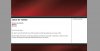
Maybe make the header part fit edge to edge within the white body. So there isn't that white space to the left and right of the header.
A single-pixel border a few shades darker than the background color around the outside of the whole thing to separate the page body from the background a little bit more.
The header bar that separates the header from the body looks like it's twice a big as it should have been and the image is repeating.
I'd also give the page a small footer based on the header style. Which can be used for contact info, copyright details, etc.
Finally I would change the font.
What I would do with the links (to better integrate them into the overall theme) is made them bold, underlined and a dark grey (#444444) by default and the hover style the color changes to a dark red (#d00000). If you prefer they weren't bold I think that would look pretty good too.
I've attached a mockup of the changes I was talking about so you can see what I'm talking about. I took a screen shot of your template and threw it in Photoshop. If you like it and would like to use it I can send you the Photoshop file if you have Photoshop.
Attachments
Last edited:
- x10Hosting Free Website Hosting
-
Free Web Hosting
-
Our Community
-
Legal