Current layout critique/feedback?

requiem9650

New Member
Messages
22
Reaction score
0
Points
0
Finally put up at least the finished layout rendition of my website:
http://pandemonium.elementfx.com/

Keep in mind the whole site is not finished as I have to pick through my graphics and post what I want, write up some tutorials, integrate cutenews and make the template for that, etc, etc.

CSS is kind of on the bright side and the graphics might not be to your taste, but aside from that, are there any fixes that are really recommended?
At the moment I'm fixing the background tile so that it's a bit darker, but most of what I'm wondering about is the CSS. Does the color fit? Is it readable? Does it strain anyones eyes to read?

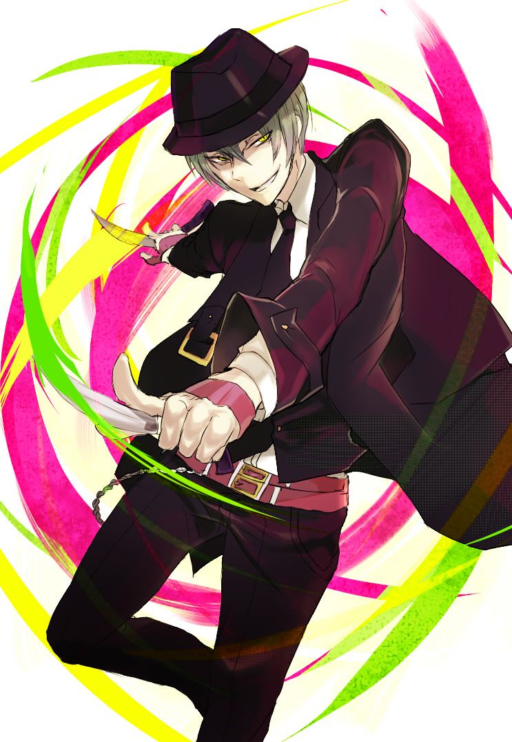
Also as you can see, I clearly like Hazama.
Here is a reference to the image used (click the thumbnail)
 

Darkmere

New Member
Messages
358
Reaction score
2
Points
0
Why is it so scrunched up ... Default users have about a 1024 width. Looking at your web page reminds me of looking at my phone. You also have a butt load of contrast errors, I would suggest changing the bg and fg colors for anywhere there is text

---------- Post added at 03:19 PM ---------- Previous post was at 03:16 PM ----------

With the color contrast errors people that are colors blind, people that have a color blind monitor (lol joking I mean a black and white monitor), or even viewed from certain angles or distance will not be able to read what you have. Not a big fan of the cross hair either lol
 

requiem9650

New Member
Messages
22
Reaction score
0
Points
0
1024 width? That is insane. And really tacky for graphic based design (seeing I don't see many people go larger than 600 width). Especially when the ideal is to go with somewhere about 775 width maximum for standard graphics based web design. Also yeah, I realize the background tile needs to be edited. Thinking of exactly how dark to go though.

Also, going to test the colors in another browser, as I literally did get all of them straight from the header image.
 

Darkmere

New Member
Messages
358
Reaction score
2
Points
0
1024 width? That is insane. And really tacky for graphic based design (seeing I don't see many people go larger than 600 width). Especially when the ideal is to go with somewhere about 775 width maximum for standard graphics based web design. Also yeah, I realize the background tile needs to be edited. Thinking of exactly how dark to go though.

Also, going to test the colors in another browser, as I literally did get all of them straight from the header image.

600 width your joking right ... 775 is not max for web design. I do not know where you get that info. 1024 is the most used width on the net http://www.w3schools.com/browsers/browsers_display.asp

---------- Post added at 06:05 PM ---------- Previous post was at 06:03 PM ----------

I dont mean to argue but even in web design classes they state not to go below 800 and not higher than 1024 but you should stay around 1024
 

requiem9650

New Member
Messages
22
Reaction score
0
Points
0
Erm, I said graphic based, not web design in general. :V I don't like my stuff to look absolutely empty. Also, I mean technically when it comes to most web design in general you would be basing it off percentages for width not specified pixel widths, seeing very few sites do that anymore, and they're all based around web graphics. I mean if I wanted a stale bland look then yeah, I could go for something big huge and impersonal/professional looking, but seeing I prefer my stuff to look like a pack of highlighters, I kinda stick within those guidelines and go with the smaller stuff. I mean, really, look around gfx sites that don't try to be 100% portfolio, a lot of them have small layouts that are very heavy on colors.

Also lol this is quickly turning into a debate.
 
Last edited:

jjkiefer8891

New Member
Messages
1
Reaction score
0
Points
0
This is the first time I've replied to a thread, and I hope I'm not turning it into more of a debate.
Darkmere is somewhat correct in the 1024, I was taught 900 was good, and my company uses around a 900px width for content in our websites but we also do business websites so it is expected to stay within corporate standards.
For a personal site it is typical to see smaller and a lot of new techniques to try and stand out.

But anyhow to the point. You mentioned you will have some tutorials, which I assume means a lot more text. The pink on red buttons is hard to read. The lime green on white is also tough to read. Also once you get a lot more text on the page the limited width will make it harder on the reader. If you want to keep the width I suggest breaking up the text a lot with bullets and spacing. Another suggestion would be to make the menu on the left a little smaller to give the content a little more room.

That is all I have for now, hope it helps a little.
 
Top