ShadowmasterX
New Member
- Messages
- 683
- Reaction score
- 0
- Points
- 0
hmm.. iono, like the thingy that you put on ur designs when you are done creating it
of course, you can. If you need I can send real draw pro format or psd file.Thank you very much.
can i use your graphics when i need it?
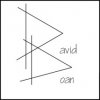
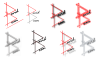
still think its too vertical, make the D's more diagonal from eachother. like the touchup work done by neo.
I too did not understand what you meant by signature, I guess you were talking about artist signature. usually, though, they just leave initials, a date, and sometimes the number the piece is of the series.