ING 75 Credits For Your Views

Do You Like It?


  • Total voters
    8
Status
Not open for further replies.

supajason

Member
Messages
288
Reaction score
2
Points
18
Hello credit seekers!

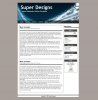
I am making a website called Super Designs, it is going to be my portfolio for designs, programs, projects etc...

I want to know what you think of the design so far. Please be honest and give your opinion (
NO one word/lines answers)

Thank You
<edit>Please Vote Too</edit>
 

Attachments

  • super-designs.JPG
    super-designs.JPG
    311.3 KB · Views: 33
Last edited:

MMOWORLD.CO.CC

New Member
Messages
202
Reaction score
0
Points
0
Doesn't look bad. The black colors give a god impressions and make the total site lite. But the total is a bit 'unpro' It looks like it's a template found with google? Is it HTML with CSS?
 

supajason

Member
Messages
288
Reaction score
2
Points
18
Its not a template, 100% made myself!
Its xHTML Strict and CSS 2.0
 

withambition

New Member
Messages
215
Reaction score
0
Points
0
I like it. It's very simple, but simple is the new trend these days. The only possible problem I see is that it's not very unique - which isn't necessarily a bad thing though. That could just be because you don't have any real content up there yet. So perhaps it will change then?

Overall it seems easily accessible. No colors are too dark or so bright. Everything seems fit. =]
 

ichwar

Community Advocate
Community Support
Messages
1,454
Reaction score
7
Points
0
Whoa, that looks great. I like that it is so simple and neat. No flashing gifs all over the place.

The only thing that I think needs to change is the boxes on the right side of the page. They look a little "drab" with just gray and white. Could you maybe add a little bit of color to them. I don't think you have enough color on your site. Maybe some red or a pale yellow?

Other than that, I REALLY like the design. It's neat and to the point and not distracting at all! GREAT work!
 

booksgo

New Member
Messages
109
Reaction score
0
Points
0
I like it, but I'd make the logo area not so deep in relation to the rest of the page, and add some subtle colours.
 

balaji2u

New Member
Messages
410
Reaction score
2
Points
0
if you make a gradient of any color for background than it would definitely rock even thought its simple.I have edited many CSS works but i didnt developed anything from a scratch you are my first motivation.good work dude.
 

ShadowmasterX

New Member
Messages
683
Reaction score
0
Points
0
Wow, that is pretty good, I like the header picture, but it is lacking some colors in the background, you should add some blue or black in the background to give it more of "personality"

besides that, it is very good *thumbs up*
 

intertec

New Member
Messages
946
Reaction score
0
Points
0
I really like it. Very simple which is good and its very to read. I like the header, nice choice of colors. Only thing that you should change is the background, its to dull and drains the life of the site. But everything else is clean and tidy. Nice work!
 

tittat

Active Member
Messages
2,478
Reaction score
1
Points
38
Oh nice, the design is not at all complex but its pretty simple and looks really nice.Nice header.Good Work.
Instead of just login button it would be nice if there can be a login box on the right side menu.Or the login box will also works just above the top navigation or somewhere else.
If you could please provide me a link to your original site, i can give a little more better review.
Good Luck.... :)
 

supajason

Member
Messages
288
Reaction score
2
Points
18
thank you all for the feed back! Im closing this offer for now! I will do somemore work and open again.
I will pay outstanding credits later
 

hamsn

New Member
Messages
290
Reaction score
0
Points
0
First of all, it's very simple and clean. I think you must increase the width a little to complete the ratio and have some columns or tables at the bottom of the page. Main content needs to be spiced up a bit, header is perfect.
I think main content must have some colors, if I forget about header, your site will look grayscale.
Think on it, that was honest!
Edit:
I meant to say, your site needs to be a bit colorful.
Thats it.
 
Last edited:
Status
Not open for further replies.
Top