eh, your not supposed to really see the text, its just supposed to be blended in the background, if you want to see the text, i will make a version with different text...
btw, its supposed to be dark, mysterious colors... its BATMAN!
--edit--
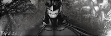
is the text better?
i just cant seem to find a place for it.... maybe keep it on the belt, but make it more visible (turn it on normal, lower opac?)
btw, its supposed to be dark, mysterious colors... its BATMAN!
--edit--
is the text better?
i just cant seem to find a place for it.... maybe keep it on the belt, but make it more visible (turn it on normal, lower opac?)
Last edited:
 i was just trying to make batman look dark and mysterious, it just looks like crap, overall i did put more work into it than civilr's, but i think it should be a tie... i think 4/10 on both of them i will keep making my "Final Fantasy style sigs" i dont like dark colored smudge to much