New Site Layout

nightbandit

New Member
Messages
53
Reaction score
0
Points
0
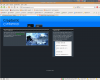
I don't know if any of you remember me (I'm the one with horrible color sense). Anyways, I've redesigned my site: http://craptastic.co.cc

The About link won't take you anywhere at the moment. As you can see I'm having some JavaScript trouble, but that's another topic that belongs in programming.

Do you think I've made the font too small? It's not hard to read is it? And do the h2s (main headings) look okay? If you have a monitor with a screen res. width of over 900px please tell me if the lines of text are too long. I made the content section 90% of the screen size and the main content section 65% of that and the sidebar is 30% leaving a 5% space. Do those measurements seem okay?

Thanks in advance.
 

xratedeggroll

New Member
Messages
1
Reaction score
0
Points
0
its a good beginning. i can see potential for what it can turn into. once you work on it more i think it will be a good outcome.
 

freecrm

New Member
Messages
629
Reaction score
0
Points
0
Unfortunately, my proxy server won't let me open the page because of the URL name!
 

nightbandit

New Member
Messages
53
Reaction score
0
Points
0
Unfortunately, my proxy server won't let me open the page because of the URL name!
Oh, didn't think about that when choosing a name.

I've included a screenshot, if your're interested. Thanks for telling me about that.
 

Attachments

  • Screenshot.png
    Screenshot.png
    270.4 KB · Views: 43

freecrm

New Member
Messages
629
Reaction score
0
Points
0
I am interested and I like!!!

Without seeing the code, the only suggestion I would have would be to put a gradient on the miiror effect for your main header logo.

Other than that, nice looking and clear!!
 

nightbandit

New Member
Messages
53
Reaction score
0
Points
0
The domain name has been changed. And, since I can't edit the original post I'll just post the new URL here.

http://craptastic.exofire.net

For those of you looking at my code. I'm trying to style the images with JavaScript and not CSS because I only want the cursor to be a pointer if the image will link to itself. And the image will only link to itself if the client has JavaScript enabled.
 
Last edited:

nightbandit

New Member
Messages
53
Reaction score
0
Points
0
Last edited:

Agenator

Member
Messages
341
Reaction score
0
Points
16
The first thought that came to mind: Thats not a reflection....
Its an okay looking site, has alot of good use of colors, but it could be alot better. First of all, the navtabs look completely out of place. Try a set horizontal navbar, or move them closer together. For the reflection, go into photoshop, and use a fethered marquee to delete the bottom 1/2 of the reflected text, then move the layer up so it looks like a real reflection, no just an upside down word. Next, I would add soem space between the top header and the articles. I like the fluidity of it but I think that you may be able to get better results by creating a fixed width page, but thats a matter of debate.
It has all the right components, just needs tweaking to get it too feel right.
Good luck
-Agenator
oh, Id give it a 6/10 fyi, witht he imporvements, I'd probably give it an 8
 
Top