Ugliest console - 6th and 7th generation

What do you think?


  • Total voters
    15
Messages
141
Reaction score
0
Points
0
What console out of the 6th and 7th generation do you believe to be the least cool looking, if not the down right ugliest? This excludes handhelds and minor/third-party consoles (with the exception of OnLive) and of course we are going by the original design of the console, as opposed to redesigns that may or may not have made the console look more sleek.

Xbox 360
xbox_360_black.jpg


Wii
nintendo-wii-console.jpg


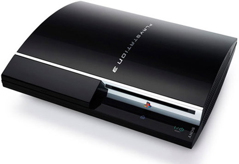
PlayStation 3
sony_playstation_3.jpg


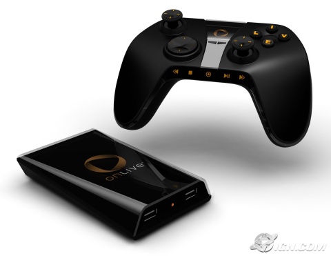
OnLive
gdc-09-onlive-introduces-the-future-of-gaming-20090324013909224-000.jpg


GameCube
nintendo-gamecube-game-console-black.jpg


Dreamcast
dreamcast.png


PlayStation 2
PS2_console.jpg


Xbox
xbox.jpg
 

Livewire

Abuse Compliance Officer
Staff member
Messages
18,169
Reaction score
216
Points
63
Onlive, and XBox (mostly due to knowing how big it is). If it wasn't that I know the size of the XBox, I'd say Gamecube, but honestly the Gamecube's kinda cute cause it's not so forkin huge :)

If Onlive wasn't a choice, I'd vote PS3 though. It looks kinda like a grill to me, like I can lift the lid and have 2 burgies on the barby...


EDIT: Splitting this up. The CONSOLES that look the worst to me are Onlive and XBox.

The CONTROLLERS that look the worst to me are Onlive and Dreamcast. I've held an xbox controller, and I've held a dreamcast controller, but there's more -on- the xbox controller and somehow it actually fits.

Although the VMU in the Dreamcast was cute. The controller still sucked.
 
Last edited:

ben.arundel28

Member
Messages
36
Reaction score
0
Points
6
Gamecube has to be the worst but the red special edition xbox360 was very ugli

PS3 is the best looking ;)
 
Messages
141
Reaction score
0
Points
0
I'd say Xbox is the worst hands down. But like Livewire said, the problem with Dreamcast is it's TERRIBLE controller. In real life Dreamcasts don't really look that bad and they are pretty small. I'd say GameCube and PS2 are the best looking. GameCube has the most amazing controller ever, but PS2 has a very thin look.
 

Brandon

Former Senior Account Rep
Community Support
Messages
19,181
Reaction score
28
Points
48
What's the LCD for on the dreamcast?
 

Livewire

Abuse Compliance Officer
Staff member
Messages
18,169
Reaction score
216
Points
63
What's the LCD for on the dreamcast?

That's the VMU; an LCD enabled Memory Card basically. Most games didn't do much with it, some let you have a virtual pet on it.

In particular there was one that was a Sonic version of Mario Party; the LCD was used to display what movement cards were in your hand. If you were playing without the VMU, they were displayed on screen. With the VMU, the other players only saw the card backing.


Overall not really necessary or required. If memory serves most games also showed their logo on the card, although if the game was so bad you'd forget what you were playing and had to check it to remember...Well there's problems. XD
 

Smith6612

I ate all of the x10Pizza
Community Support
Messages
6,517
Reaction score
48
Points
48
I would have to say the Dreamcast. Looks to be rather bulky in design and doesn't look to have a natural controller. Other than that, the others have a decent design to them.
 

SniperFox

Member
Messages
75
Reaction score
0
Points
6
I would have to say the Dreamcast. Looks to be rather bulky in design and doesn't look to have a natural controller. Other than that, the others have a decent design to them.

The Dreamcast is actually very small. About as small as the Gamecube in width, and a little bigger than the PS2 in height. Not bulky at all.

The controller is another story.

Ugliest system, in my own opinion, is the Halo 3 Xbox 360. That thing is the most hideous shade of green I have ever seen.

It's like baby poop green/brown. Just...UGH. The actual STYLING of the system is sexy ( As is the Slim ), but that color choice was horrible.

My favorite, style wise ( And my overall favorite system ), is the PS3. Despite it being rather large in form - it still manages to be fairly sleek. The metal/chrome ( On some models ) trim, keeps it from just sticking out like a sore thumb in most entertainment centers. it looks like it belongs there.

Ugliest of the LAST generation, is a tie between the original PS2 and the Behemoth of the Xbox. The PS2 looked like a VCR, or a radiator or something. the Xbox - was just to big and bulky to be sexy. The Gamecube was ugly - I mean...it was just a cube, for crying out loud - but it was small, and kind of looked like a CD Player Alarm Clock.
 

skai123

Member
Messages
204
Reaction score
0
Points
16
you say the original of the console, yet you have a pic of PS2 slim? lol
 
Top