WorthingtonBaptistChurch.com Looking for thoughts on the design/colors

wbaptist

New Member
Prime Account
Messages
24
Reaction score
1
Points
3
http://www.worthingtonbaptistchurch.com/index.shtml

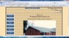
I added a border with CSS to my Churches website today. I think the boarder makes it look better, but the plain tan backgroud just does not look quite right. Any color suggestions? And what are your thoughts on the boarder does it make it look better?

Also every since I first created this site it has half felt like a homemade site to me (which I guess it is). I keep trying to figure out what it is that gives me that feeling, but I can't figure it out.

Feel free to send anyother constructive critisim my way if you feel the urge to. :biggrin:

Thank you for taking a look.
 

carl6969

Community Support Team
Community Support
Messages
6,874
Reaction score
206
Points
63
In simple terms I like it a lot. Perhaps there is a little bit of a "homemade" look to it but I do not see that is a negative thing. A simple but attractive website that somebody put a lot of thought and work into. I browsed though the site from the prospective of somebody who might want more information about your church, service times, events at the church, and information about the pastor and I found more complete information than I usually find at church websites. Very good work in my opinion. I would not change anything.
Regards
Carl
 

wbaptist

New Member
Prime Account
Messages
24
Reaction score
1
Points
3
Thank you carl6969 for taking the time to look over the site and writing the comments. :)
 

nuwanpra

New Member
Messages
45
Reaction score
2
Points
0
Hi,

Well I'm using 1366 x 768 screen to see your site. I have attached a screen shot of my view. As you can see on it the image of the church isn't fully visible (half visible). So it can be negatively effect on user impression.

Lettering on left side button in not much eye catching you can make some changes to it for more clarity. I suggest you to use a non script type font.

I really like your background. Please keep it with site.
 

Attachments

  • Church.jpg
    Church.jpg
    362.3 KB · Views: 16
Last edited:

wbaptist

New Member
Prime Account
Messages
24
Reaction score
1
Points
3
Hi,

Well I'm using 1366 x 768 screen to see your site. I have attached a screen shot of my view. As you can see on it the image of the church isn't fully visible (half visible). So it can be negatively effect on user impression.

Lettering on left side button in not much eye catching you can make some changes to it for more clarity. I suggest you to use a non script type font.

I really like your background. Please keep it with site.
Hmm, I see what you mean about how the bottom half of the image is cut off. Thanks for the suggestions.
 
Top