3D guitar

galaxyAbstractor

Community Advocate
Community Support
Messages
5,508
Reaction score
35
Points
48
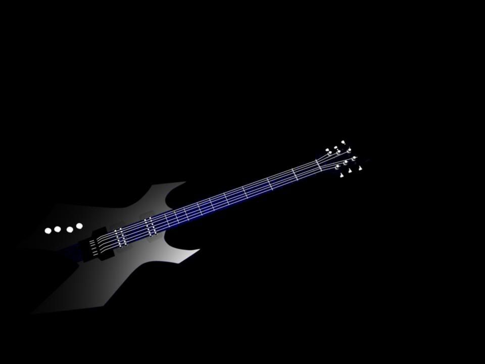
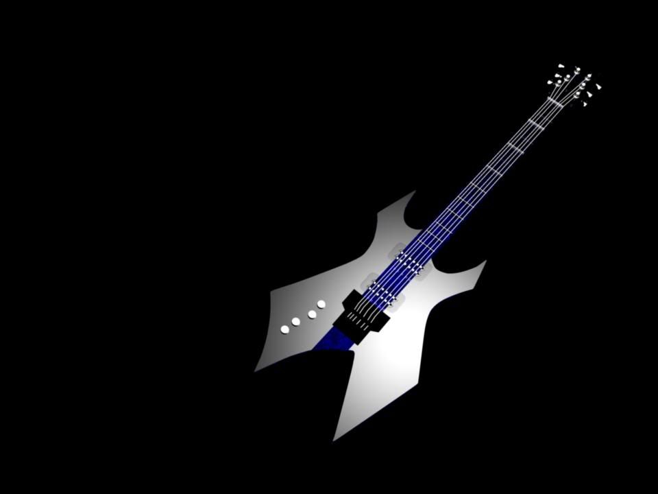
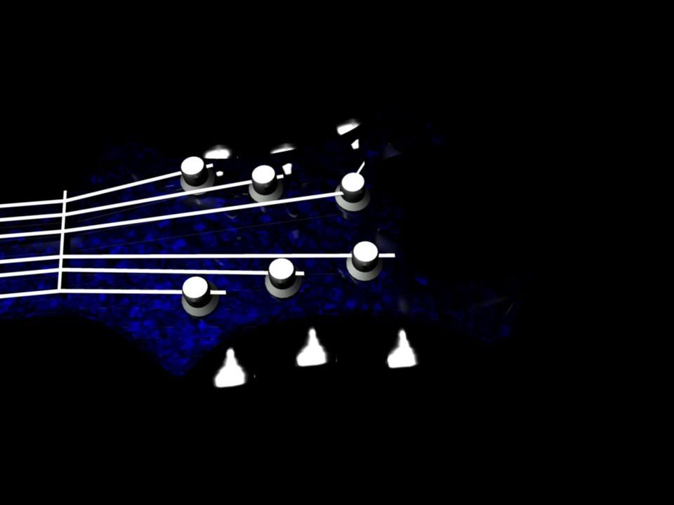
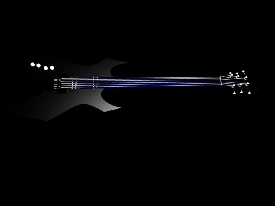
We had lowpoly production as a project the latest 3 weeks, and here is one part of the work:

gittar4.jpg


gittar3.jpg


gitarr5.jpg


gitarr2.jpg


gitarr.jpg


What do you think?

Program: Autodesk Maya 2009 ultimate
Renderer: Mental Ray
 
Last edited:

Noodles8

New Member
Messages
39
Reaction score
0
Points
0
Program?
Renderer?

The edges of the guitar body seem too sharp. Softer edges would also help with the lighting and appearance.

Why do the stings seem to stand out just fine, when the body itself fades to black? The material? Something that refracts and diffuses the light a little more might help(less mirror like).

But keep up he good work. :) Keep improving.
 

galaxyAbstractor

Community Advocate
Community Support
Messages
5,508
Reaction score
35
Points
48
Program?
Renderer?

The edges of the guitar body seem too sharp. Softer edges would also help with the lighting and appearance.

Why do the stings seem to stand out just fine, when the body itself fades to black? The material? Something that refracts and diffuses the light a little more might help(less mirror like).

But keep up he good work. :) Keep improving.

Autodesk maya 2009 with mental ray as renderer.

I use mi_car_paint_phen on the guitar body and mi_car_paint on top of mib_glossy_refraction for the blue thing. The strings are just a lambert because I didn't find any mettalic shader.
 

scottnj

Member
Messages
122
Reaction score
0
Points
16
Program?
Renderer?

The edges of the guitar body seem too sharp. Softer edges would also help with the lighting and appearance.

Why do the stings seem to stand out just fine, when the body itself fades to black? The material? Something that refracts and diffuses the light a little more might help(less mirror like).

But keep up he good work. :) Keep improving.

I agree, definitely is a little hard on the edges, and it is kind of hard to see the body of the guitar. But the overall design looks pretty cool. keep it up :biggrin:
 

ShadowmasterX

New Member
Messages
683
Reaction score
0
Points
0
thats pretty cool dude,
just work on the painting and the lighting/glares, then it would be awesome
 

Twinkie

Banned
Messages
1,389
Reaction score
12
Points
0
Really nice, but only the neck and head of the guitar looks 3D. You should make the backround white so you can see it better =)
 

galaxyAbstractor

Community Advocate
Community Support
Messages
5,508
Reaction score
35
Points
48
Yeah, just round the edges a bit and It would be awesome.

My teacher messed it up...

There is rounded corners, but only 4 segments. I tried bevel it more, but maya tried to do a 4x4x4x4 segment crashing the program
 

KSclans

New Member
Messages
197
Reaction score
0
Points
0
add some background the dark background made it not that real.. and yea work on the edges the surface of the 2nd image is not that real, it look too 2D like a flat plane
 
Top