*!*!*New Layout!*!*!*

SEÑOR

The Guy Everyone Hates
Messages
4,638
Reaction score
0
Points
0
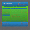
I just made a new layout in Photoshop CS3, please rate it.
 

Attachments

  • blue_green_glass-WATERMARKVERSION.gif
    blue_green_glass-WATERMARKVERSION.gif
    102.8 KB · Views: 89
Last edited:

mikel2k3

New Member
Messages
748
Reaction score
0
Points
0
4/10

colours are terrible, lol... And the layout isnt great either.
 

Zenax

Active Member
Messages
1,377
Reaction score
4
Points
38
I don't like the colours much. They don't blend very well. Try using different tones of the same colour instead, like dark and light blues, or silver and blue go well together
 

Brandon

Former Senior Account Rep
Community Support
Messages
19,181
Reaction score
28
Points
48
Yeh 2/10, The colors don't match, get a better color scheme and maybe it'll look better.
 

DrewC

New Member
Messages
42
Reaction score
0
Points
0
5/10 It's ok, but not good enough to get a good. Just take a little more time when creating a layout.
 

swirly

Active Member
Messages
1,930
Reaction score
0
Points
36
the bottom edges in the largest box need to be feathered more. the green background doesnt look so good. try #0033FF for the background color and see how it looks...
 

Derek

Community Support Force
Community Support
Messages
12,882
Reaction score
186
Points
63
Ugh i don't like it colors are VERY bad.. 0/10
 

eZakto

Member
Messages
782
Reaction score
1
Points
18
Colors... -4
Simplicity -1
Other: Maybe you will get problems with scrolls: -1

4/10

Bye :D
 

IamShipon1988

New Member
Messages
942
Reaction score
0
Points
0
The image transition is not that good, you can see the break offs. I can see you tried to go with the Web2.0 look however doesn't really work with the blue you used. I would suggest a lighter color, try #0099CC. That's my favorite web2.0 color. Plus use linear effects, much easier.
5/10
 

valor

New Member
Messages
50
Reaction score
0
Points
0
3/10 colors hard on eyes.. layout ok, mainly update colors, touchup layout, background needs fixing.. looks like grass or twigs. It could mess up your font depending on what you use.
 

Cubeform

New Member
Messages
339
Reaction score
0
Points
0
That background is horrible. The green hurts the eyes and so does the watermark; try using a slightly less intrusive one (one that's grey).

And that reflection thing at the end: It's just not working for you. Ditch it.
 
Top