You are using an out of date browser. It may not display this or other websites correctly.
You should upgrade or use an alternative browser.
You should upgrade or use an alternative browser.
Review my template!
- Thread starter intertec
- Start date
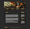
To me, I think it looks to blah, and amatuer looking. I recommend different colors, try going to http://www.colourlovers.com/. And I recommend reading a few tutorials on how to make navigation panels.
- Messages
- 5,257
- Reaction score
- 97
- Points
- 48
I like the buttons.
matrixman1
New Member
- Messages
- 5
- Reaction score
- 0
- Points
- 0
8/10 Nice template .... i Like it
- x10Hosting Free Website Hosting
-
Free Web Hosting
-
Our Community
-
Legal