You are using an out of date browser. It may not display this or other websites correctly.
You should upgrade or use an alternative browser.
You should upgrade or use an alternative browser.
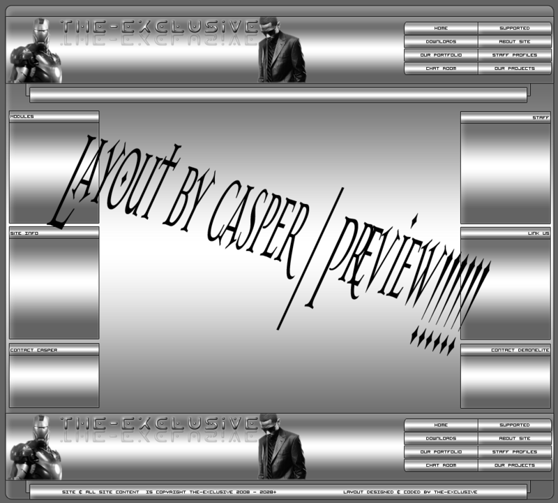
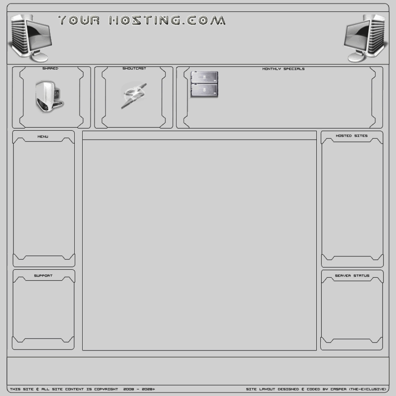
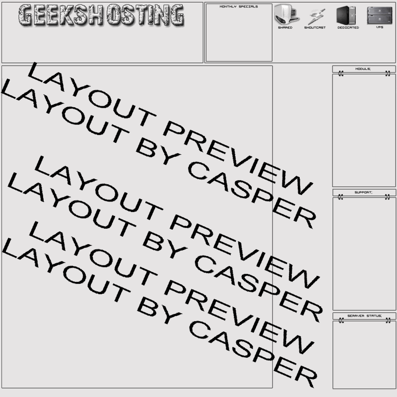
Some of my designs
- Thread starter effects
- Start date

Insanenight
New Member
- Messages
- 101
- Reaction score
- 0
- Points
- 0
yup old fashion but thats how most ppl started =] i like em.
lordsofvine
New Member
- Messages
- 41
- Reaction score
- 0
- Points
- 0
i like the second and the third one but the first one is to much, like others said adjust gradients. nice.......
Sohail
Active Member
- Messages
- 3,055
- Reaction score
- 0
- Points
- 36
The colours aren't that good though i like that last image design, a tip for you would be to find some good colour schemes to go with your sites. Colour Lovers would be a good place to start.
- x10Hosting Free Website Hosting
-
Free Web Hosting
-
Our Community
-
Legal