How well is my site designed?

str82u

New Member
Messages
43
Reaction score
0
Points
0
The site I host here is www.freepeoplesearch.us . It was designed to validate at W3 and is pretty stripped down to compete SEO wise against larger sites, but if anyone has more suggestions to get more of and advantage for the term "free people search" or to improve it's eye appeal would be appreciated.
 

sunils

New Member
Messages
2,266
Reaction score
0
Points
0
Looks simple to me. But lot of words in the home page itself. You should try to bring out what you want with the site in your design.
 

RRJJMM

New Member
Messages
41
Reaction score
0
Points
0
Nice three column layout. You might consider centering it and limiting the size of the header. It looks nice and professional, so why not take it a couple of steps further.

Cheers,
 

frankfriend

Member
Messages
410
Reaction score
2
Points
18
Why are the columns so much narrower than the header?
The` searches seem to hop to expensive money charging third parties?
Is this really a specialisewd affiliate type site?
 

farscapeone

Community Advocate
Community Support
Messages
1,165
Reaction score
27
Points
48
Too much text on the first page is never a good thing.

Layout is simple ... too simple.
 

str82u

New Member
Messages
43
Reaction score
0
Points
0
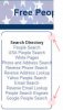
Some asked about the header being so wide, affiliate status and the amount of text on the home page.

The header just fills the top of the screen conveniently, though I'll try it narrower in an A/B test to gauge if users react differently.

Yes, the main search box is an advertiser that sponsors it. If you look at any of the content pages (the keywords drip off this site) users have searches from several free sources to choose from, the sponsored search is free, including sign up.

The amount of text was a first attempt at wooing Google (or any other search engine) That's something else I'll be experimenting with, I'll cut back on that to see if there is any effect. Thank you for the suggestions about this, they are reminders in this case. I have a pocketful of sites and sometimes the new ones get left hanging a while.


Thanks for everyone commenting and checking the site so far, it's really nice to see people involved and I appreciate knowing folks are paying atention and not just signing in and running off to fulfill the forum condition for free hosting like I had been doing.

BTW: Any comments from users viewing this site with 1024x768 would be appreciated also, please let me know your screen resolution.
Str82u
 
Last edited:

farscapeone

Community Advocate
Community Support
Messages
1,165
Reaction score
27
Points
48
I use 1024x768 and it looks fine (just like 1280x1024), but there are some other problems. Is seams that it's only working correctly in IE. In Opera and FF page is not centered (it's aligned left) and there's some problems with "Search Directory" box (see image below "Untitled-1.jpg"). Again it works fine in IE.

And what's with the loading image (see loading.jpg below)?
 

Attachments

  • Untitled-1.jpg
    Untitled-1.jpg
    13.7 KB · Views: 20
  • loading.jpg
    loading.jpg
    36.8 KB · Views: 19
Last edited:

vol7ron

New Member
Messages
434
Reaction score
0
Points
0
The loading image seems to be a background image. Technically it's faster, but as Leviathon pointed out, if there's an error on the page, it might be viewable.

Also double checked what he said and he's right, it's not cross browser yet.


As for the space around the border, that's cuz the paragraph you have in the table data cell (<td><p>...) has a margin-top and margin-bottom on it. I don't know where it's defined, but you'll have to set it to 0.
 
Last edited:

str82u

New Member
Messages
43
Reaction score
0
Points
0
I use 1024x768 and it looks fine (just like 1280x1024), but there are some other problems. Is seams that it's only working correctly in IE. In Opera and FF page is not centered (it's aligned left) and there's some problems with "Search Directory" box (see image below "Untitled-1.jpg"). Again it works fine in IE.

And what's with the loading image (see loading.jpg below)?


OK, got my style.css to jive with FF. Forgot it wasn't installed. Had to use a different text-align: -moz-center; for that.

The loading image is something I've kept around since the days of dial up. It's just a tiny background image that loads first, so if the content on a page takes a little longer to load, site visitors have something to keep them satisfied a few seconds longer instead of wondering "Is this site working?" or "Is my browser locking up?"

vol7ron said:
As for the space around the border, that's cuz the paragraph you have in the table data cell (<td><p>...) has a margin-top and margin-bottom on it. I don't know where it's defined, but you'll have to set it to 0.

Thanks for the solution on this one, I moved the "class" attribute to the <td> and removed the <p>

These were big ones, thanks so much to you both!
 

farscapeone

Community Advocate
Community Support
Messages
1,165
Reaction score
27
Points
48
-moz-center did fix the problem in FF but it's still not centered in Opera, Chrome and Safari.
 
Top